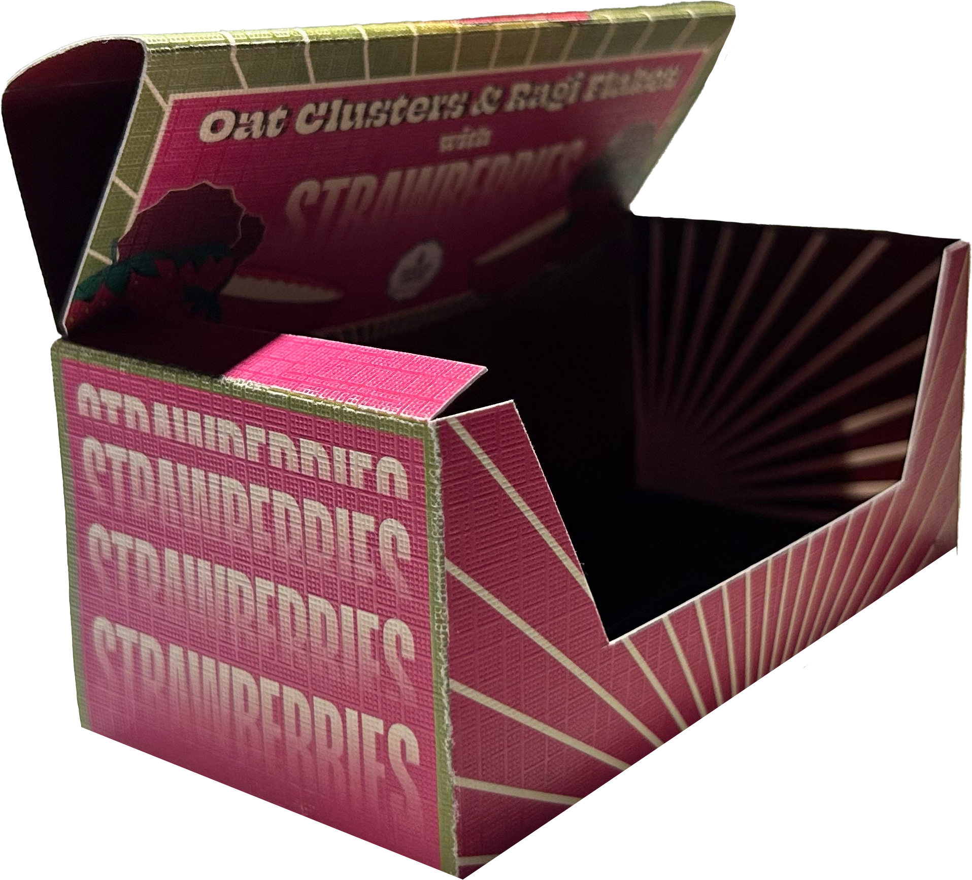
The cereal packaging is designed to captivate consumers with striking visuals while offering a highly functional and practical experience. Upon purchase, the box remains securely closed, preserving freshness.
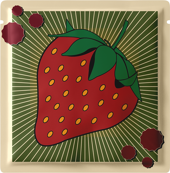
Once opened, it reveals neatly packed individual sachets of cereal, promoting portion control and preventing overeating by providing just the right amount for each serving.
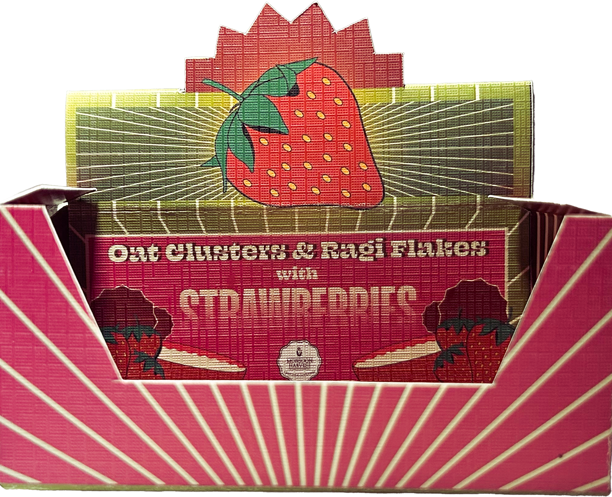
The innovative design allows the box to be folded into a compact, display-like stand that can be conveniently placed on the kitchen counter.
This makes it easy to grab a sachet on busy mornings, ensuring a quick, hassle free breakfast while maintaining an organised and visually appealing space.
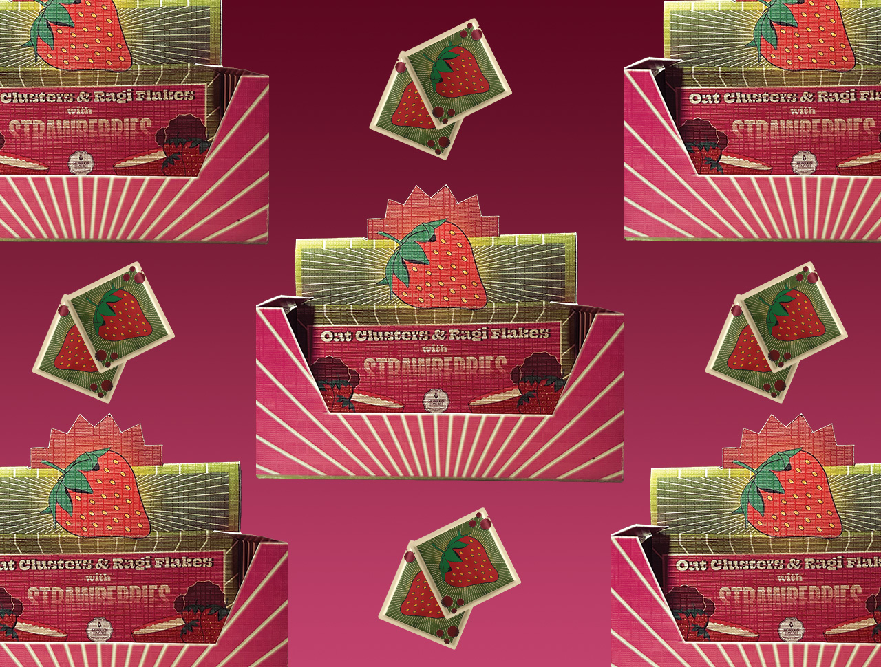
Open the box
Fold the box in
this manner
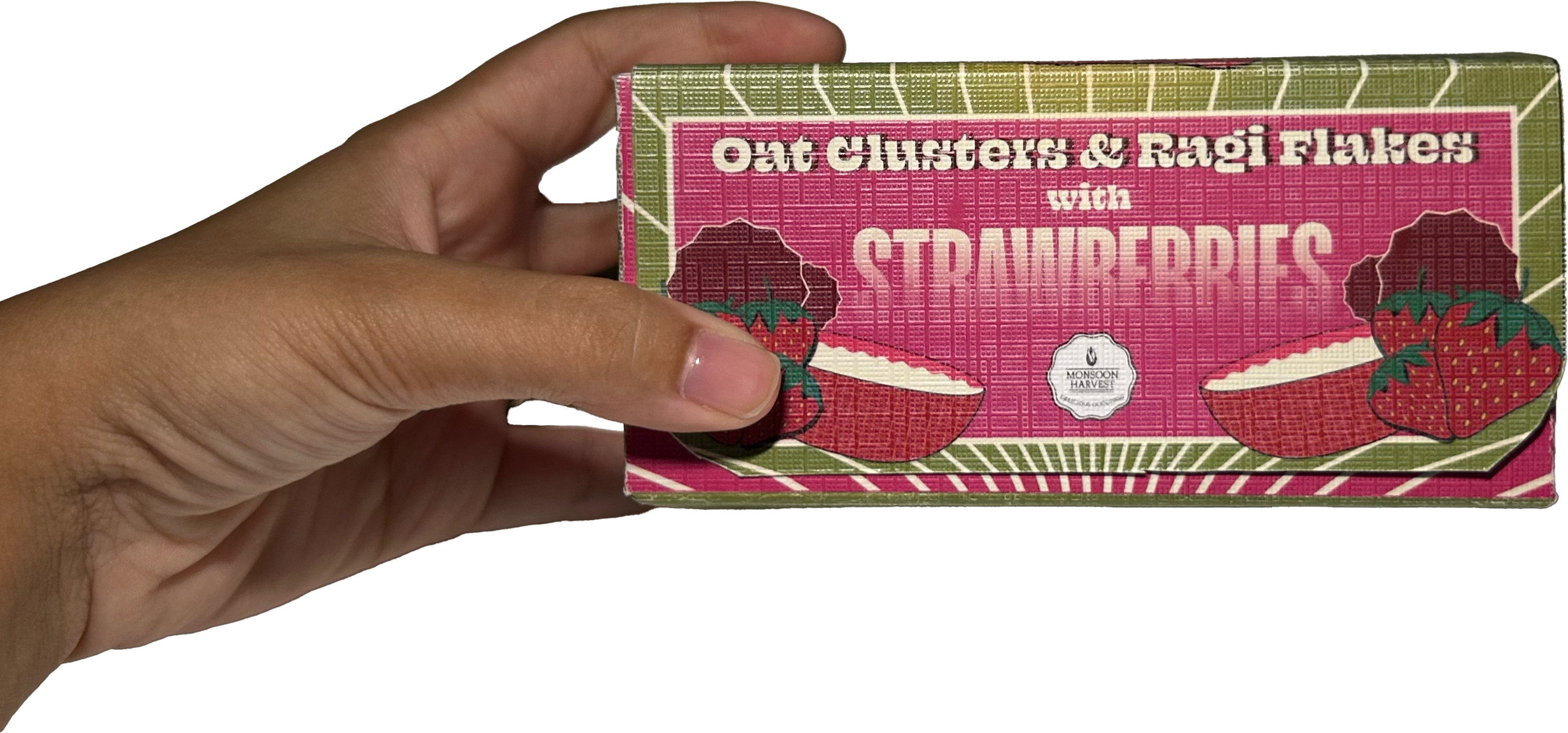
In a rush? Grab
a sachet and go!
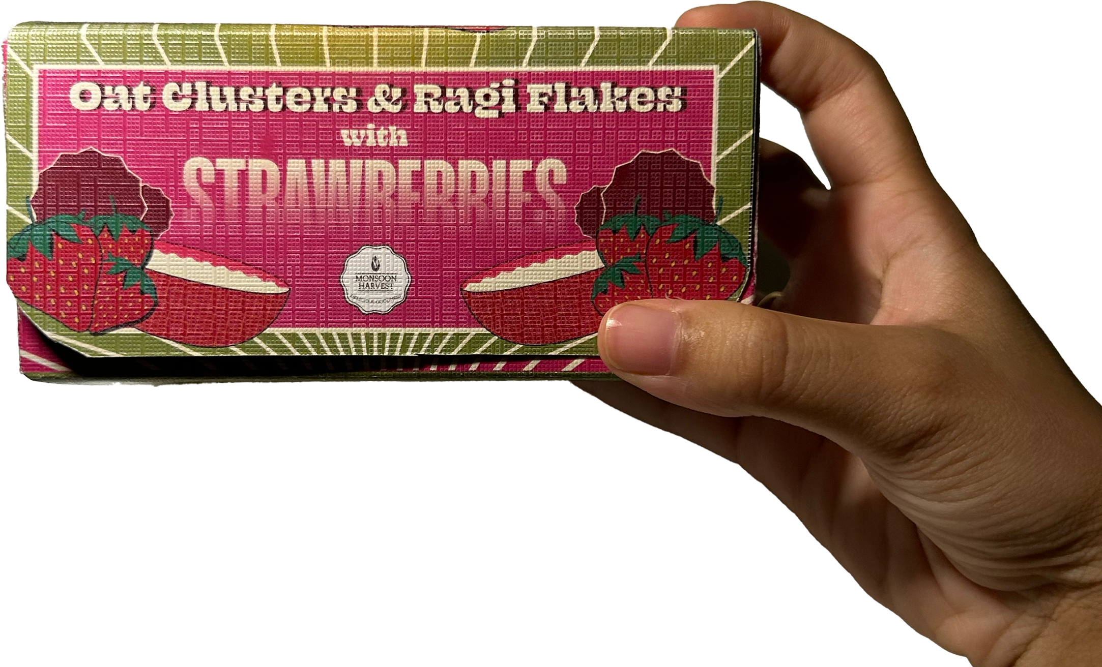
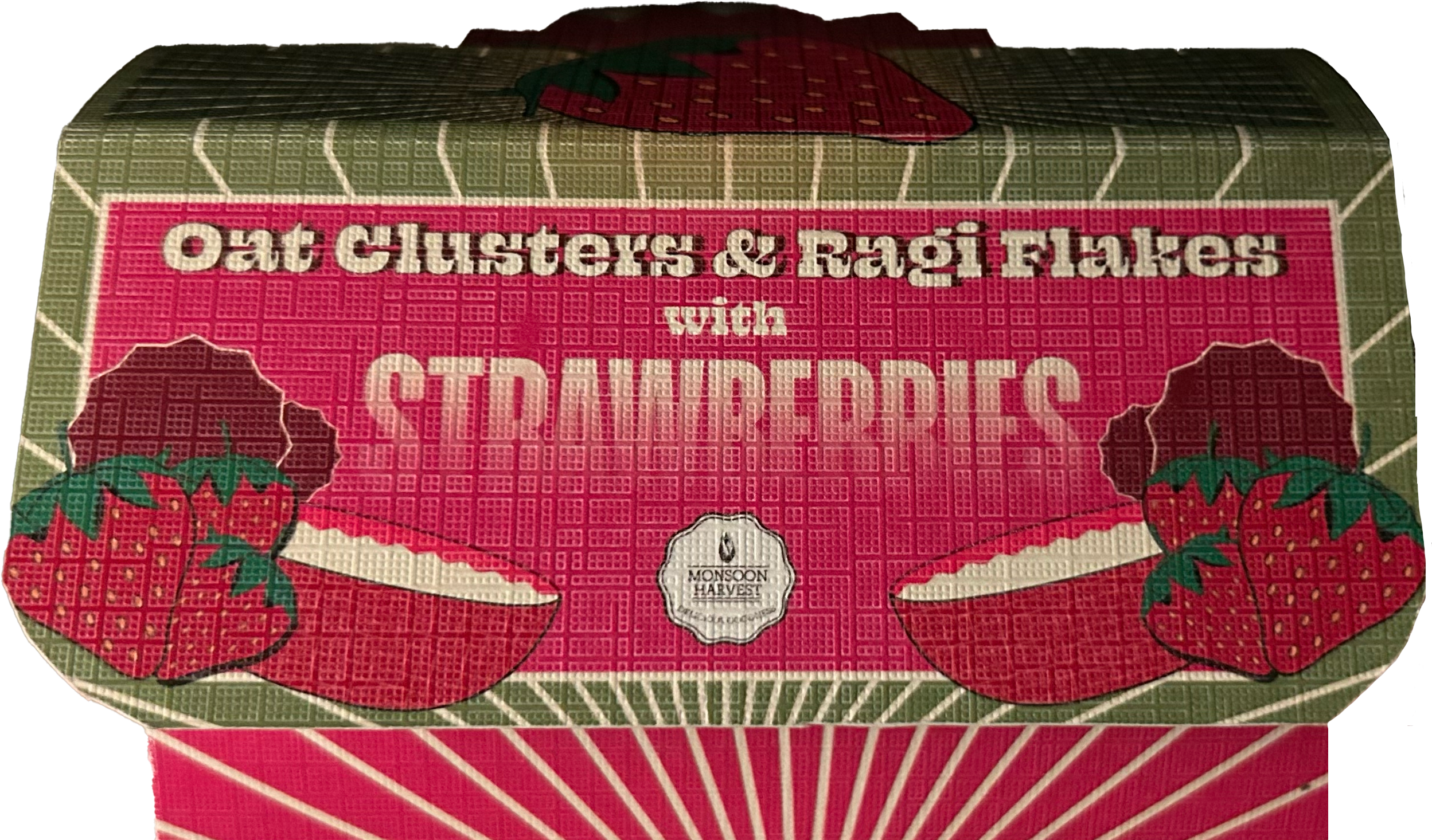
This cereal packaging is a bold fusion of maximalist illustration and uncluttered design, where vibrant colours and expressive visuals create a striking yet harmonious look.
illustrations made